Mobile-First Design: Why It’s Non-Negotiable
Over 70% of online shopping happens on phones now. Here’s how to design your store so mobile customers have a seamless experience from browsing to checkout.

The Reality of Mobile Commerce
Let’s be honest — if your store doesn’t work on phones, you’re losing customers. It’s not even a debate anymore. The numbers are clear: mobile traffic accounts for over 70% of all e-commerce visits in Canada, and that percentage keeps climbing. But here’s the thing: just making your site “mobile responsive” isn’t enough.
We’re talking about building the mobile experience FIRST, then scaling up to desktop. It’s not backwards — it’s actually the smartest approach. When you start mobile, you’re forced to make smart choices about what matters. You cut the clutter. You prioritize speed. You focus on the essential steps between “I want this product” and “I bought it.”

Why Mobile-First Actually Works Better
Mobile-first design starts with constraints. You’ve got a 375-pixel-wide screen. That forces you to make hard decisions: What do customers really need to see? What’s just decorative noise? What’s actually blocking sales?
When you build this way, something interesting happens. Your mobile site becomes cleaner, faster, and more focused. Your desktop site becomes better too — because you’ve already figured out what matters. You’re not trying to squeeze a desktop experience into a phone. You’re expanding a smart mobile experience to fill a bigger screen.
The speed factor: Mobile users are impatient. They’ve got 3 seconds before they bounce. When you design for mobile first, performance becomes non-negotiable. You’ll optimize images, minimize requests, strip away bloat. Those improvements help desktop too.
Mobile-first also means you’re designing for touch, not hover states. Touch targets need to be 48 pixels minimum — that’s about the size of a fingertip. Buttons, links, payment buttons — they all need real space. No tiny hover-only menus. No surprise overlays that are impossible to close on a phone.

The Mobile-First Strategy: What to Actually Do
Design Navigation That Works on Phones
Forget the horizontal mega-menu. You don’t have space. Use a hamburger menu or a bottom navigation bar — whichever you choose, make sure it’s easy to open and close. Main categories should be instantly visible. Search should be one tap away, not buried.
Simplify Product Pages for Thumb Navigation
On a phone, customers scroll with their thumb. That means images should be tappable and swipeable. Price and “Add to Cart” shouldn’t be hidden below the fold. You’ve got about one screen height to convince someone this product is worth looking at. Use it wisely.
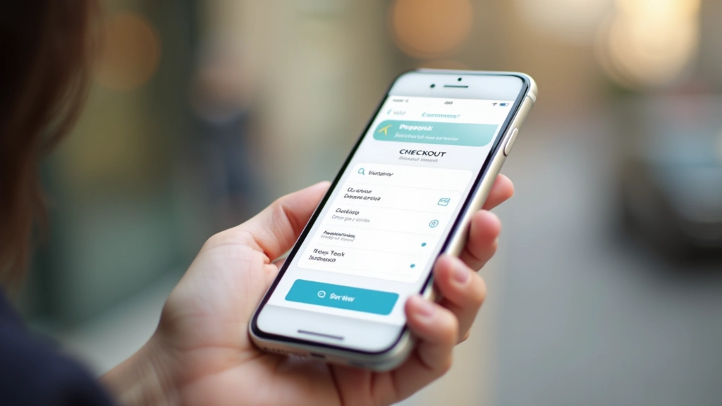
Build a Checkout That Doesn’t Lose Sales
Mobile checkout is where most stores fail. Long forms are death on phones. Auto-fill everything you can. Minimize required fields. Show progress — let customers know they’re on step 2 of 3, not stuck in an endless form. One-click payment options aren’t nice-to-have; they’re essential.
The Technical Side: Performance Matters
Mobile customers often have slower connections than desktop users. That 4G network isn’t always reliable. So you need to be ruthless about performance.
Start with images. Product photos are important, but they don’t need to be massive. Optimize for mobile screens (720 pixels wide is plenty). Use modern formats like WebP. Lazy-load images below the fold so the first screen loads fast.
Aim for: First Contentful Paint under 2 seconds on 4G. That’s the moment your store becomes visible and interactive.
Test everything: Use Google’s Mobile-Friendly Test and PageSpeed Insights. These aren’t just rankings — they affect whether customers even see your store in search results.
Minimize code: Every JavaScript library, every tracking script, every font file adds weight. Does it need to be there? If not, remove it.

“We redesigned for mobile first and our conversion rate went up 23% in three months. We weren’t trying to — we were just removing what didn’t work on phones.”
— Sarah, E-commerce Store Owner
Common Mobile-First Mistakes to Avoid
Tiny Touch Targets
Buttons smaller than 48×48 pixels are nearly impossible to tap accurately. People miss them. They get frustrated. They leave.
Slow Loading Times
A 5-second load time on mobile kills sales. You’re competing against apps that open instantly. You’ve got to be faster.
Hidden or Unclear CTAs
“Add to Cart” shouldn’t be below the fold or disguised. Make it obvious. Make it prominent. Make it impossible to miss.
Overly Complex Forms
Asking for 15 form fields kills checkout completion. Ask for what you actually need. Save everything else for later.
Auto-Playing Videos
They’re slow. They use data. They’re annoying. If you must use video, let users choose to play it.
Unoptimized Images
A full-resolution 4MB photo designed for print will tank your mobile site. Optimize ruthlessly.
How to Get Started Right Now
You don’t need a complete redesign. Start small. Pick your most popular product page. Open it on your phone. Can you add something to your cart without zooming in? Can you see the price immediately? Can you reach the checkout button with one hand?
If you answered “no” to any of those, that’s where to start. Fix those problems. Then move to the next page.
Most stores don’t need a complete rebuild. They need refinement. Better spacing. Bigger buttons. Faster images. Clearer navigation. These aren’t expensive changes — they’re just deliberate choices made with mobile users in mind.
Test with real people. Watch someone try to buy something on their phone. Don’t guide them. Just watch. You’ll see where they struggle. Those are your priorities.

The Bottom Line
Mobile-first isn’t a trend. It’s reality. Your customers are shopping on phones. They’re comparing prices on phones. They’re making purchase decisions on 6-inch screens in parking lots and coffee shops. If your store doesn’t work great there, you’re leaving money on the table.
The good news? Designing for mobile actually makes you a better designer. It forces clarity. It demands performance. It eliminates clutter. And when you build mobile first, your desktop experience becomes naturally excellent too.
Start today. Pick one page. Test it on your phone. Fix what breaks. Repeat. That’s how you build an e-commerce store that actually converts on mobile.
Related Articles


About This Article
This article provides educational information about mobile-first e-commerce design practices. It’s intended to help you understand design principles and best practices. Every online store is different, and what works best for your specific business depends on your products, audience, target market, and goals. We recommend testing strategies with your actual customers and analyzing the results. Results vary based on implementation quality, existing infrastructure, and numerous other factors beyond design alone.